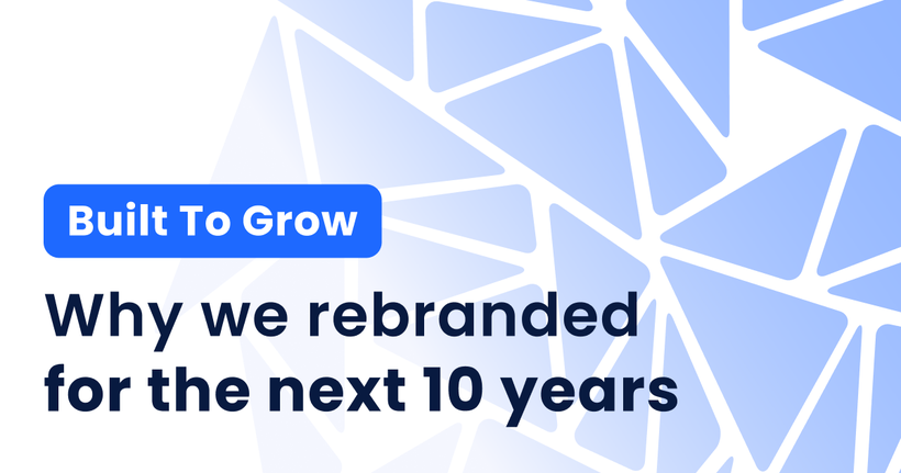
Built to Grow: Why We Rebranded WebinarGeek for the Next 10 Years
Caroline
02 February 2026 - 3 min
Our challenge
Our app grew. Our brand didn’t.
This year we celebrated 10 years of WebinarGeek using the same logo we launched with. It did its job for a long time. But at the scale we operate today, its limits have become harder to ignore.
The colors were difficult to work with and lacked enough contrast, which made designing slower and the experience less accessible for users. The core shapes were already there, but they were hard to apply consistently. The system simply wasn’t modular enough to support everything we were building.
What once helped us move fast was now holding us back. And that showed up in the product experience.
The reality
Over the past few years, the app itself has been completely renewed. We rebuilt flows, added functionality, and expanded what WebinarGeek can do, all with the future in mind.
The brand didn’t keep up.
It no longer reflected who we are today, how much we’ve grown, or what we stand for as a company. That doesn’t mean it was bad. It just meant it was time to take a step back and renew it.
Our priority
We wanted to build a brand that is as strong, accessible, and scalable as the app itself. Not something designed for the next launch or campaign, but something that will still make sense ten years from now.
That led us to one clear choice: build a system, not a style.
A system gives structure without being restrictive. It creates consistency without killing flexibility. And most importantly, it grows with you.
The concept: six building blocks
The new logo and visual identity are built from six building blocks. Together, they form a clear and recognizable whole. Individually, they are flexible and reusable across product and marketing.
The logo itself tells a clearer story than before. It is built from triangular shapes that come together in the same space. Different sizes represent different dimensions, from industries and geographies to teams, customers, and students.
The gaps between the shapes matter just as much as the shapes themselves. They represent the connections between people, companies, and ideas. The negative space is where interaction happens. Those same triangles, spacing, and rhythm now form the foundation of our wider visual language.
Each building block reflects a core principle.
Accessibility
Intuitive, inviting, and readable. Higher contrast, clear hierarchy, and design choices that work for everyone, not just a few.
Modularity
A brand built from reusable parts. Easy to scale, easy to adapt, and consistent across contexts.
Consistency
One visual foundation that works everywhere. In the product, in marketing, and in support.
Flexibility
A system that works together while leaving room for variation. Clear guidelines instead of rigid rules.
Recognizability
You don’t just see individual elements. You recognize the brand as a whole.
Future-proofing
Designed to grow with new features, new audiences, and new stories.
Color evolved.
We stayed with blue to maintain continuity but evolved it to better match where we are today.
A more electric blue adds energy and clarity across screens and print. A deep navy brings structure and confidence while also improving contrast throughout the system. Together, they create a palette that feels familiar but works harder than before.
More than our own brand
That six-piece puzzle isn’t just how we rebuilt our brand. It’s also an invitation.
Whether you’re working on your branding, planning a webinar, or shaping your next campaign, the same questions are worth asking:
Is your visual language accessible to everyone?
Is your message readable and usable in every context?
Can elements stand on their own without breaking the whole?
And maybe the most important question of all: does what you show still reflect who you are today?
Sometimes, renewal isn’t a luxury. It’s maintenance.
Related articles
8 Audience Engagement Tactics That Stop the Drop-Off
You can feel the exact second a webinar starts losing people. The chat slows down. Cameras go dark. Attention moves somewhere between another tab and a phone screen. That drop-off doesn’t happen because your topic lacks value. It happens because audience engagement wasn’t built into the experience. That is exactly what we are going to fix here. You will see 8 audience engagement strategies that focus on what you do when attention starts to slide, not what you planned an hour earlier
Webinar branding in 2026: look like you from signup to replay
Discover why consistent webinar branding matters in 2026 and how to create a trustworthy experience from registration to webinar room to replay, without extra work.
Why Webinar Analytics Matter and How They Improve Your Results
Discover why webinar analytics are essential for better engagement, stronger follow-up, and smarter decisions. Learn which metrics matter and how to use them to improve every webinar.