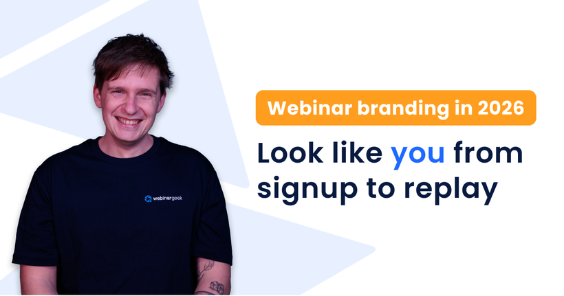
Webinar branding in 2026: look like you from signup to replay
Caroline
19 January 2026 - 4 min
There was a time when webinar branding meant one thing: put your logo on the first slide and maybe use your brand colors if you remembered.
That time is long gone.
These days people stumble onto your webinar in between meetings from a forwarded invite, a search result, or an AI-generated summary that gave them just enough context to click. They’re very quick to decide whether your webinar feels worth their time.
Most of that decision happens before you ever speak.
Good webinar branding doesn’t shout. It reassures and tells people that they’re in the right place. It makes the whole journey feel trustworthy and unmistakably yours.
Branding is not about looking good; it’s about feeling consistent.
When we talk about webinar branding, it’s easy to think in visuals only. Logos, colors, maybe a background image.
But attendees don’t experience your webinar as a single moment. They experience a sequence.
They land on a registration page.
They get a confirmation email.
They add the event to their calendar.
They join the webinar room.
They watch the replay days or weeks later.
When your registration page, emails, webinar room, and replay all feel connected, people show up with less doubt, more trust, and more focus.
Why this matters more now than it used to
Two things have shifted in the last few years.
First, discovery happens everywhere. Search results, social previews, forwarded links, and AI summaries. Often, people see about your webinar before they ever see your actual page. That makes clarity and consistency more important than cleverness.
Second, attention is fragmented. People join late, rewatch bits, and use replays more. Branding helps them orient themselves instantly, making it easier to jump back in.
Where branding really does its work
Most of the impact of your branding happens before and after the live webinar.
Your registration page sets the tone. In WebinarGeek you can make the registration flow feel like your brand by:
Using a logo that works in light mode and dark mode
Setting your theme colors (default or custom)
Letting attendees choose light or dark mode if you want

Metadata plays a bigger role than many people realize. The title and description don’t just affect search; they shape how your webinar shows up in social shares and calendar invites. That tiny preview often decides whether someone clicks or scrolls on.
If you prefer to keep the page out of search, use privacy settings like Unlisted or Private.
Then there’s the webinar room itself. When the environment feels like an extension of your brand, not a separate tool, people focus on the content instead of the interface. Even details like clearly labelled roles (host, moderator, etc.) make the session feel more thought-through.

And finally, the replay. For many teams, that’s where most views actually happen. When the replay still looks and feels like your brand, it doesn’t age as quickly. It stays usable, shareable, and relevant.
Turning webinars into something people recognise
If you run webinars more than once in a while, consistency compounds.
A branded webinar channel turns individual sessions into a recognizable series. Over time, people start to know what to expect from you. The design fades into the background, and the content takes the lead.
That’s when webinars stop feeling like one-off events and start feeling like part of how you communicate.
Less setup, fewer decisions
One of the quiet benefits of good branding is that it saves time.
Once you’ve decided which logos to use, which colors belong in the webinar environment, how you name sessions, and how you describe them, every new webinar gets easier. You spend less time tweaking and more time thinking about what you actually want to say.
That’s also where newer features, like AI-supported titles or collecting questions during registration, help in a practical way. Not by replacing your voice, but by helping you get to a solid first version faster.
The bottom line
Webinar branding is not about making things look polished.
It’s about making the experience feel intentional and trustworthy.
When everything from signup to replay feels like it belongs together, people move through the experience with less friction. And when friction disappears, results usually improve without you having to add anything extra.
Set the foundations of your branding once and let consistency do the rest of the work. This way you can focus your energy where it matters most: the conversation with your audience.
Explore hosting webinars today
Start free trialRelated articles
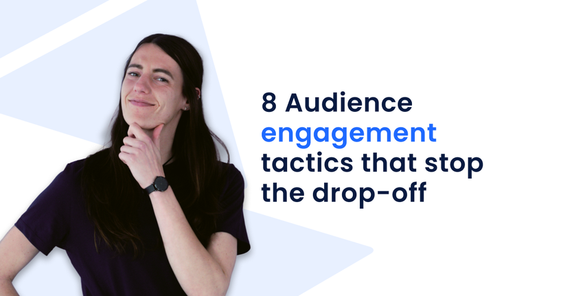
8 Audience Engagement Tactics That Stop the Drop-Off
You can feel the exact second a webinar starts losing people. The chat slows down. Cameras go dark. Attention moves somewhere between another tab and a phone screen. That drop-off doesn’t happen because your topic lacks value. It happens because audience engagement wasn’t built into the experience. That is exactly what we are going to fix here. You will see 8 audience engagement strategies that focus on what you do when attention starts to slide, not what you planned an hour earlier
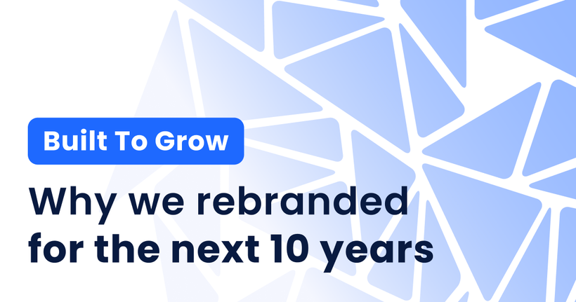
Built to Grow: Why We Rebranded WebinarGeek for the Next 10 Years
Why we rebranded WebinarGeek. From accessibility and modularity to a future-proof brand system built to grow with our product and users.
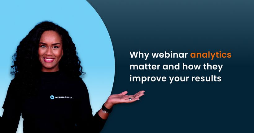
Why Webinar Analytics Matter and How They Improve Your Results
Discover why webinar analytics are essential for better engagement, stronger follow-up, and smarter decisions. Learn which metrics matter and how to use them to improve every webinar.